Case Study
The Home Inspector
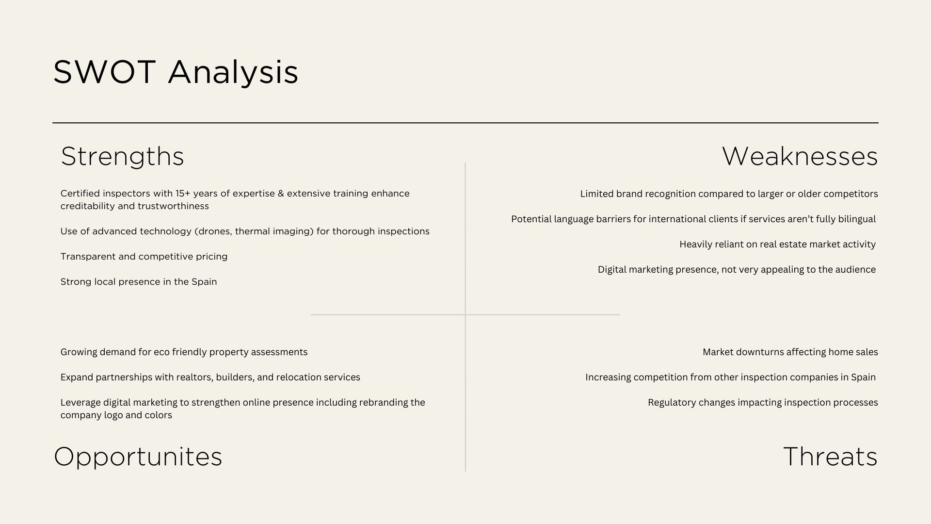
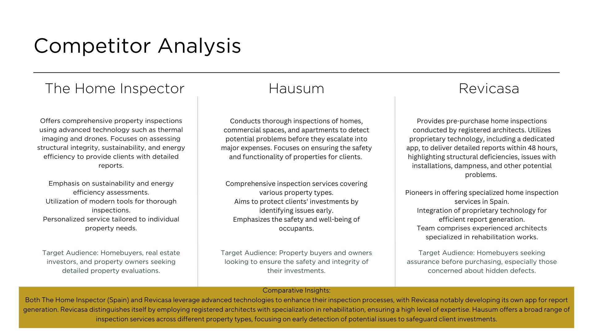
The Home Inspector (Spain) was founded by a team of technical architects with 15 years of experience, specializing in construction solutions and materials. They provide professional property inspections using cutting-edge technology like thermal imaging and drones.
Their mission is to help homebuyers make informed decisions by offering detailed reports on a property’s structure, sustainability, and energy efficiency. They stand out for their personalized service, tailoring each inspection to the specific needs of the home and client.
Overview
Client
The Home Inspector (ES)
The Company
As mentioned, The Home Inspector is a professional inspection company that evaluates the condition of residential and commercial properties. They provide services such as pre-purchase home inspections, new construction inspections, mold testing, radon testing, and detailed property reports to help clients make informed decisions. Their goal is to ensure safety, quality, and transparency in real estate transactions
The Onliness Statement
The only home inspection company in Spain that combines certified bilingual expertise with detailed digital reporting and next-day service, helping international and local buyers make confident property decisions with speed and clarity.
Studio
Adobe
My Role
Rebranding
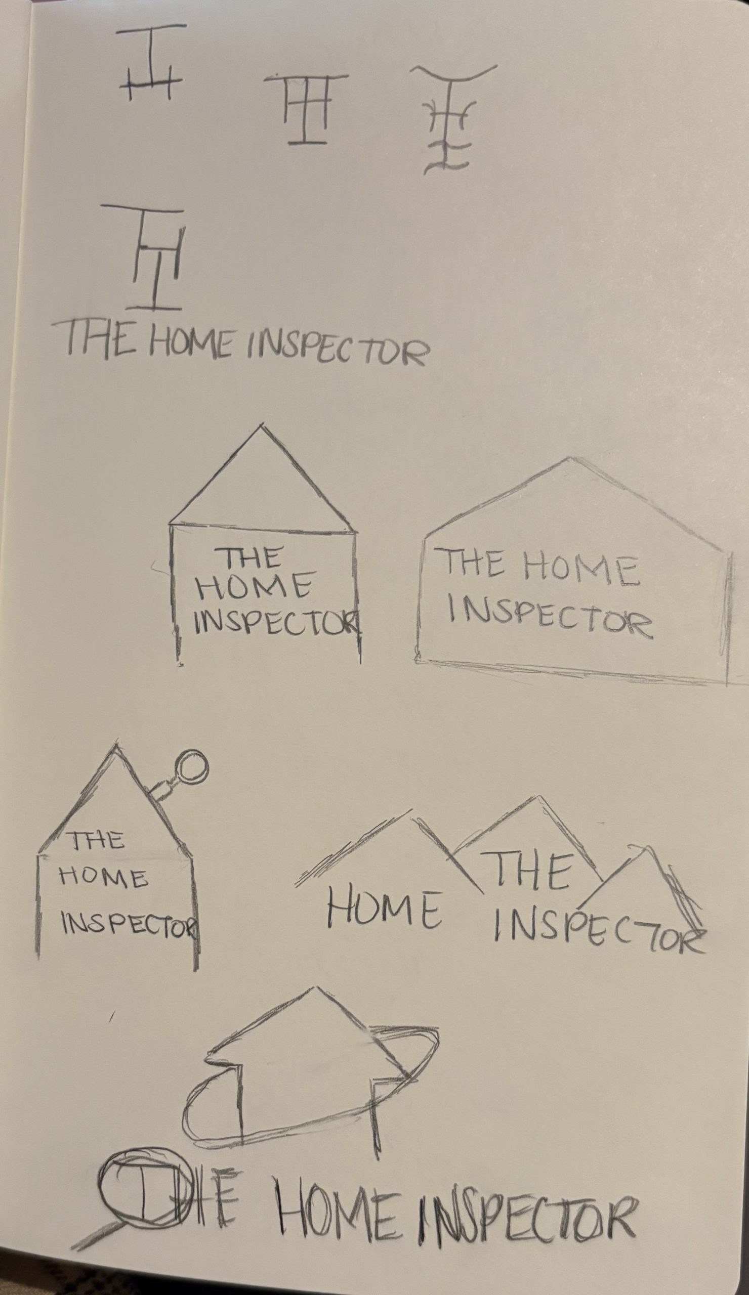
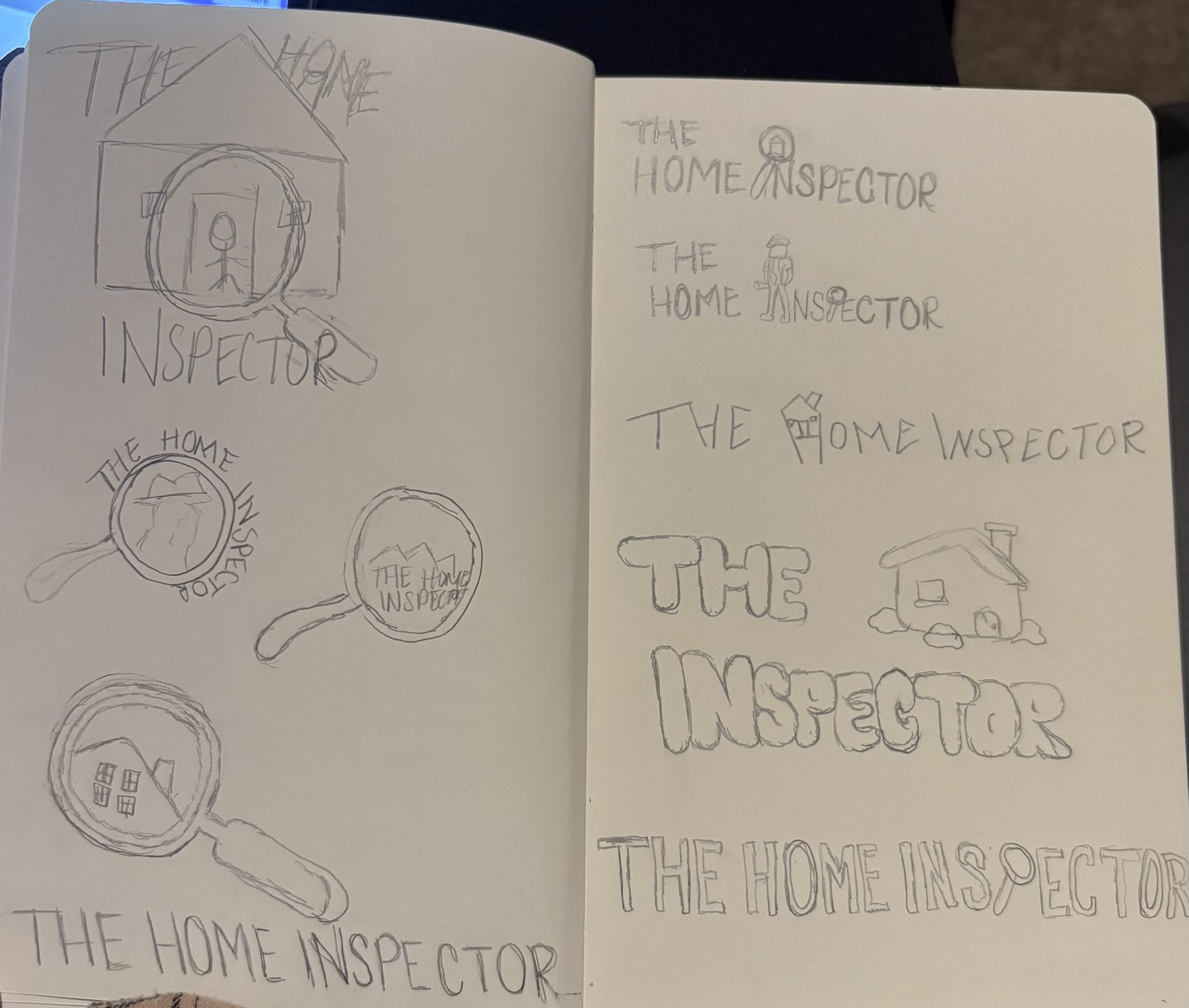
Sketches
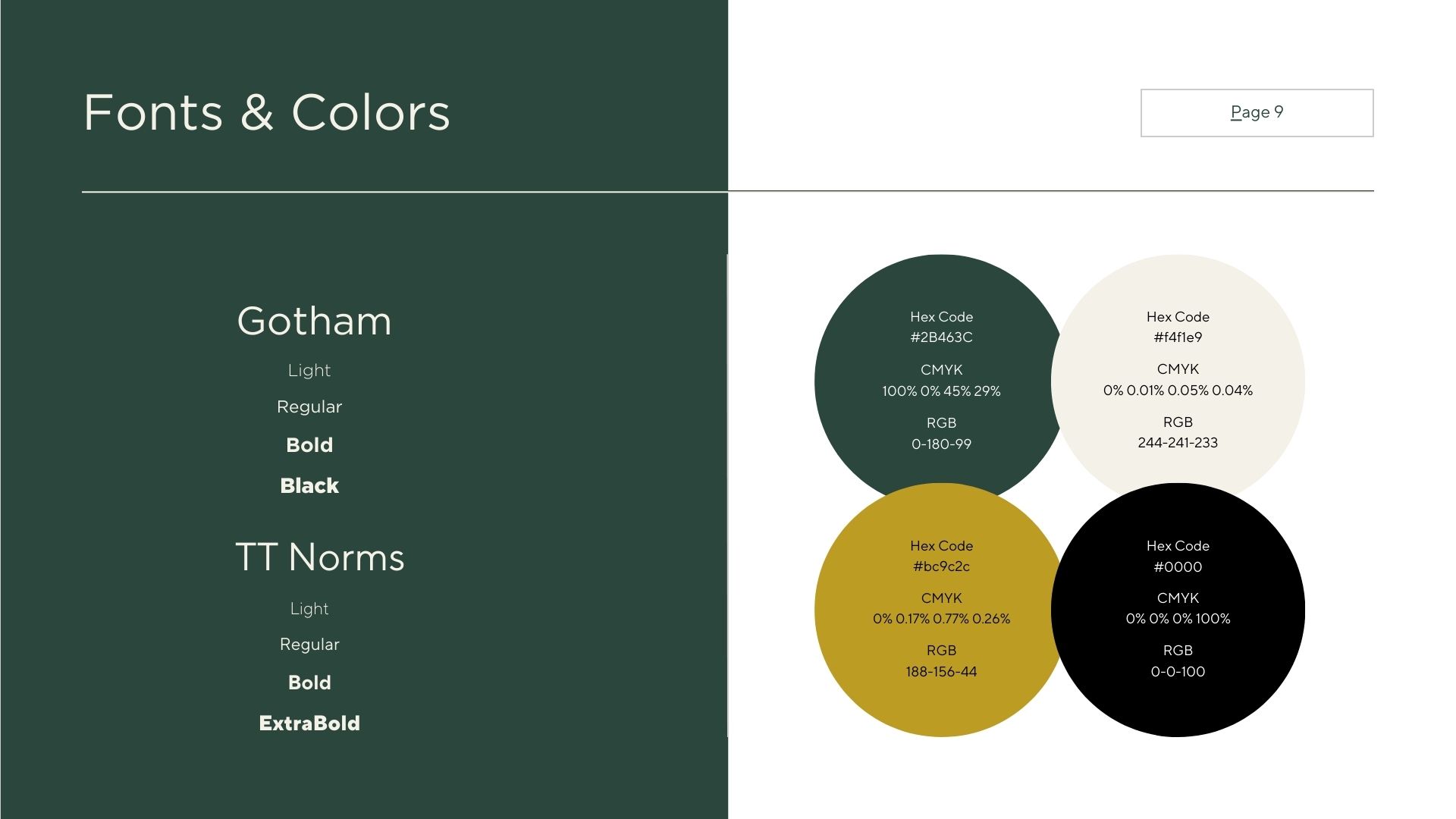
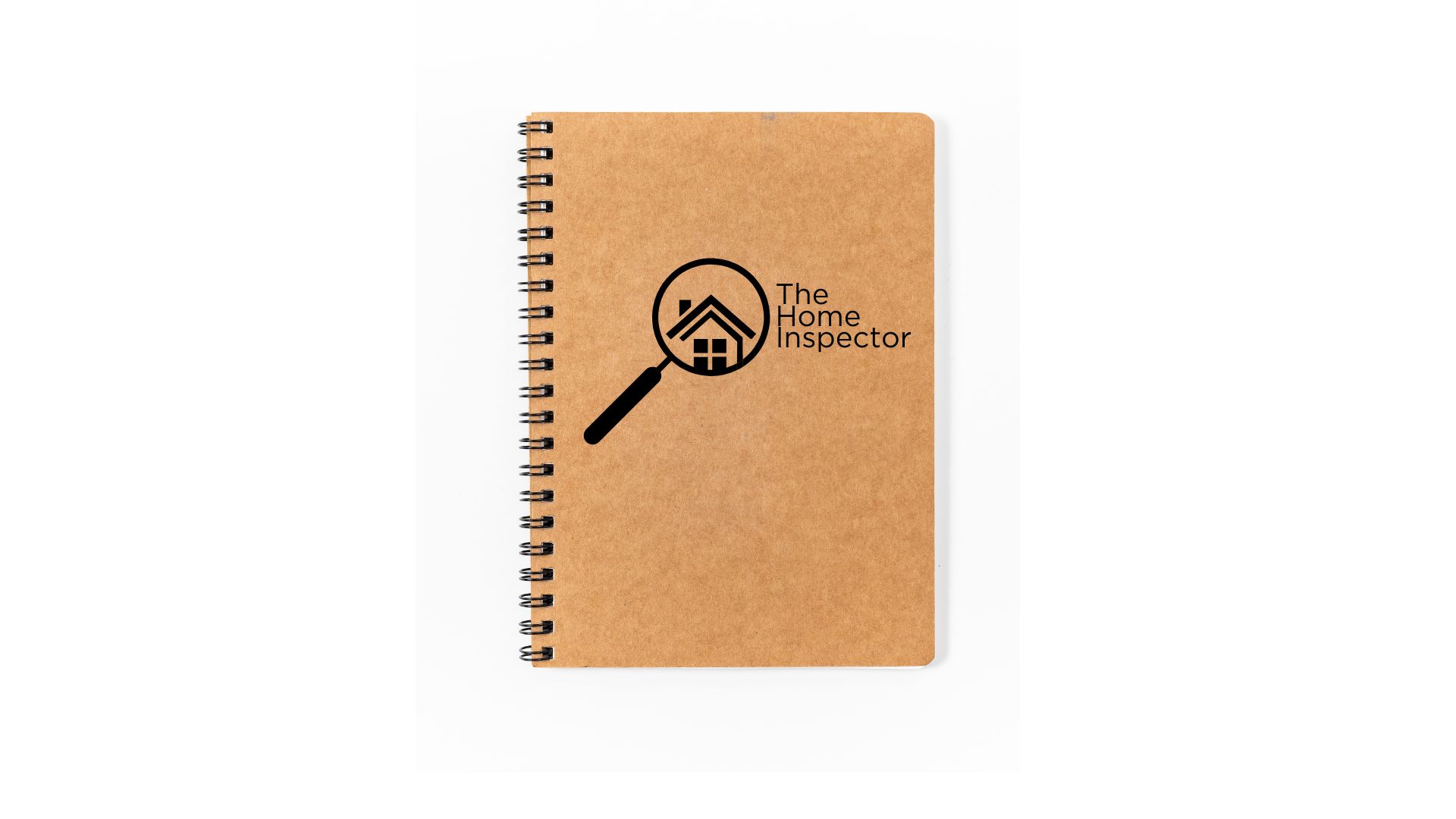
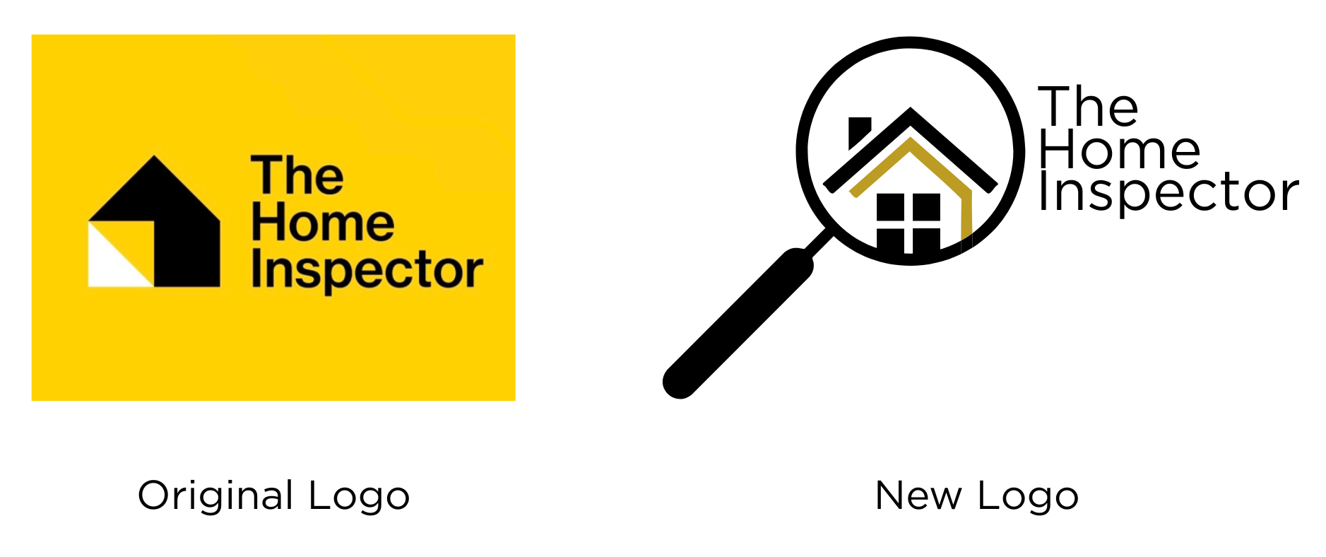
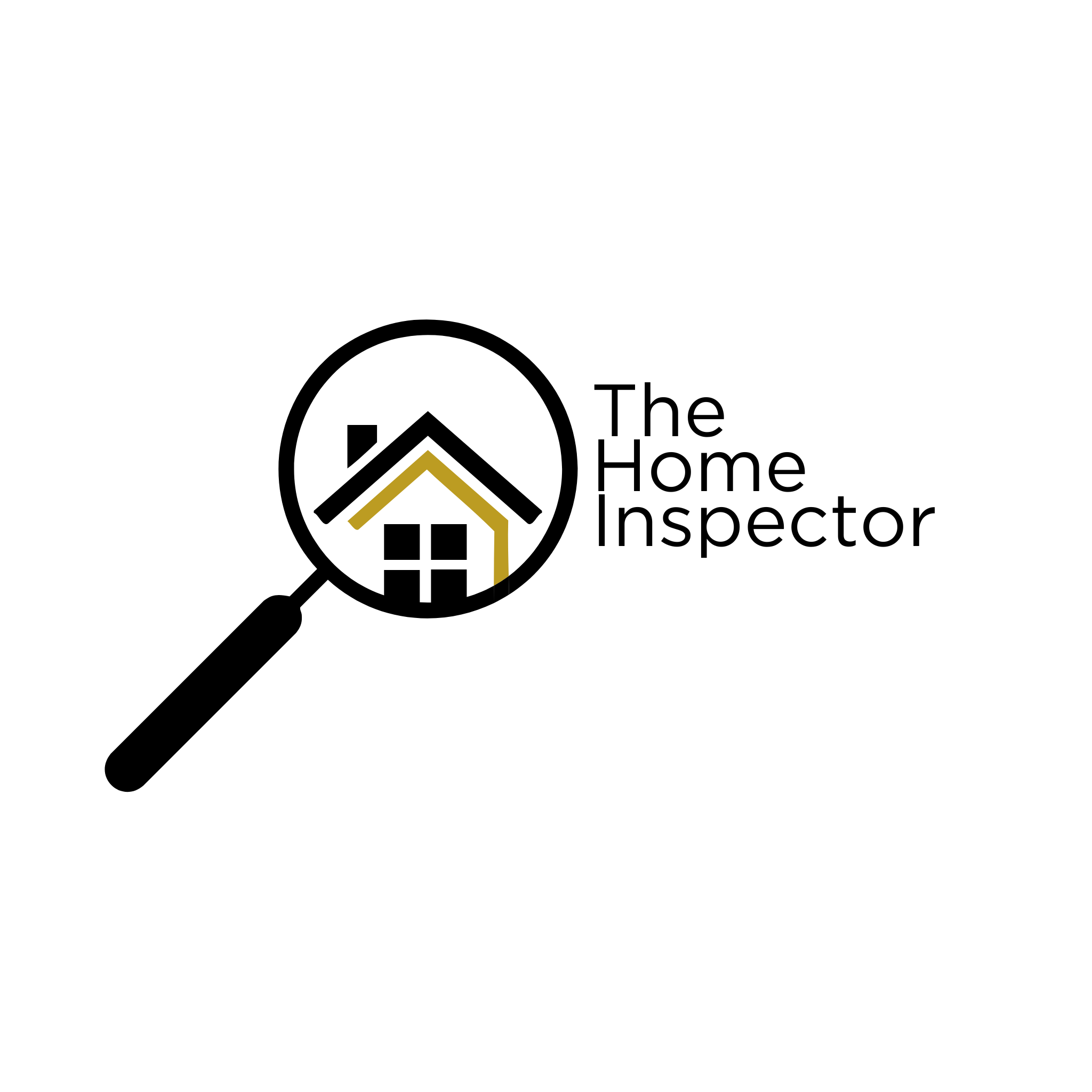
For this company rebranding, I decided to have gold as my primary color which is typically associated with prestige, luxury, success, and wealth. I believe it conveys a sense of high quality and elegance. As for my secondary color, I chose black to associate with power, authority, and exclusivity. Additionally, I recreated the logo with adding a magnifying glass with a house on the inside to symbolize a close inspection or careful examination of something related to the home.
